
Wright-Patt Credit Union
Ohlmann Group // Art Direction + Design
Wright-Patt Credit Union is the largest member-owned credit union in Ohio and is one of the 50 largest credit unions in the United States. Their commitment to their members sets them apart from other banks and credit unions. They care about improving lives vs. keeping people stuck in a cycle of desperation.
I have been the lead designer on most of their projects, including marketing campaigns, a revamp of brand guidelines, website design, annual reports, and more. All people featured in marketing materials are actual members, which adds an extra layer of authenticity to the brand. Below are some of my favorite projects I’ve had the opportunity to work on for them.

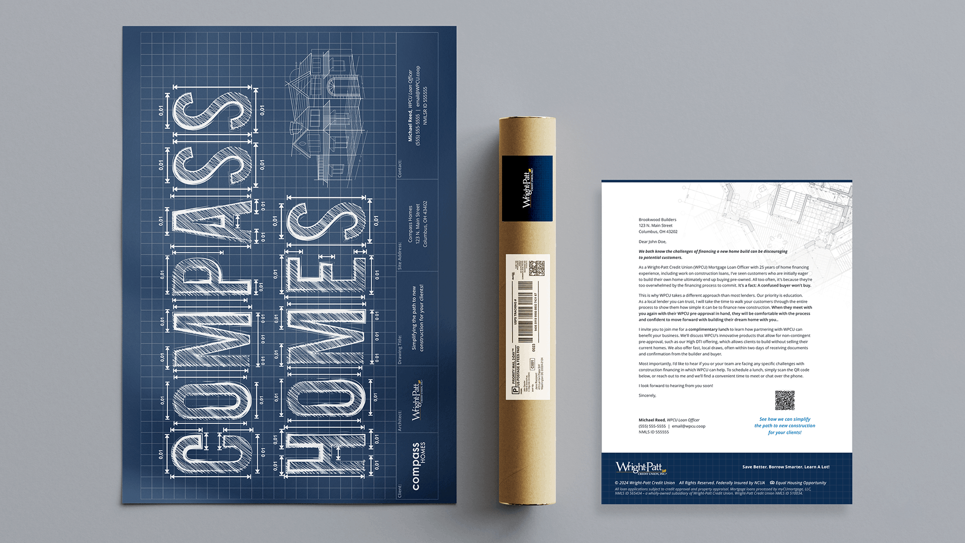
Homebuilders Blueprint Mailer
Ohlmann Group // Art Direction + Design
Recognition // Award of Merit, AAF Dayton
WPCU® asked us to create a direct mail piece that would attract the attention of homebuilding construction companies in the Dayton and Columbus areas. Five loan officers provided a list of companies and contact persons, which we used to customize each mailer.
We created a blueprint-themed poster and letter. The poster featured each company’s name on the front. We intended for recipients to keep the poster and hang it in their offices. The poster was also accompanied by a letter detailing what WPCU could offer them and an invitation to have WPCU treat them to lunch.


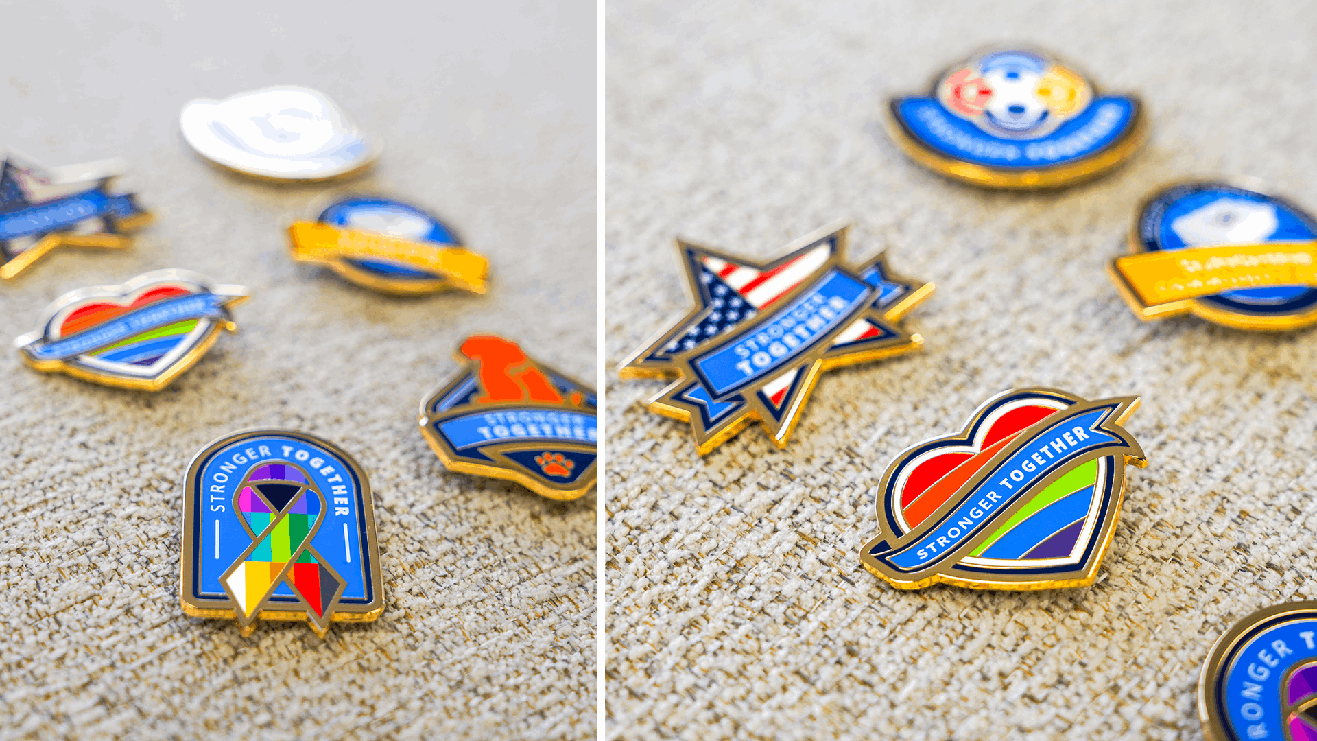
Cause Pins
Ohlmann Group // Art Direction + Design
The Sunshine Community Fund (SCF) is the giving arm of Wright-Patt Credit Union. These pins were an SCF initiative promoting different causes, including military, cancer awareness, diversity and inclusion, pet lovers, and pride. WPCU Partners can purchase pins they resonate with and can wear on their name badge lanyards. Proceeds go to support the Sunshine Community Fund.


Annual Report 2022
Ohlmann Group // Art Direction + Design
Annual reports are one of my favorite types of projects to work on. Presenting mundane statistics in an engaging and visually appealing way is a fun challenge. For WPCU’s 2022 annual report, we introduced a new vibrant orange color to the brand to help break up the cool blue/white/gray palette they have. Pairing that with real-life member photos brings this piece to life, giving it a warm and inviting approach while remaining professional and informative.


