7 Years of Annual Reports
Ohlmann Group // Art Direction + Design
Client // Area Agency on Aging
Printing // Oregon Printing
It’s not often that a client comes by and trusts you fully. I fell in love with layout and Indesign because of this client. For over 7 years, we kept the same page count but changed the design and theme to match the tone of each year’s annual report. I love seeing my progression as a designer, and this client and series will always hold a special place in my heart.
Area Agency on Aging, PSA 2 is an independent, private, nonprofit corporation that plans and funds services for older persons in west central Ohio.
2022
Advocacy & Action
Recognition // Silver Addy, AAF Dayton
The definition of Advocacy is the public support or recommendation of a particular cause or policy. What better representation of an advocate who takes action than a superhero? The theme for this year’s annual report leans into a comic book style with its bright colors and bold typography. Its powerful movement represents actions the agency and caregivers perform daily. In this theme, caregivers are the narrative's hero, and the workforce shortage is the villain that must be defeated.
2021
Resiliency and Resolve
Recognition // Silvery Addy, AAF Dayton
When I think of the words Resilient and Resolve, my mind goes to the environment. Whether a weed growing through concrete or abandoned theme parks becoming overgrown with plant life, nature has a way of standing firm and resuming its natural place in the world. This concept uses organic, natural shapes and colors that are an extension of the brand and tv commercials. There is a watercolor element to them paired with light and airy photography and natural paper texture. These elements symbolize how natural the agency's core values are to its mission. The typography also has an organic and welcoming feel to it. The letterforms' curves represent the ability to avoid conflict and find the path of least resistance, much like the agency's ability to navigate obstacles that have arisen due to the pandemic.
2020
Keeping The Connection
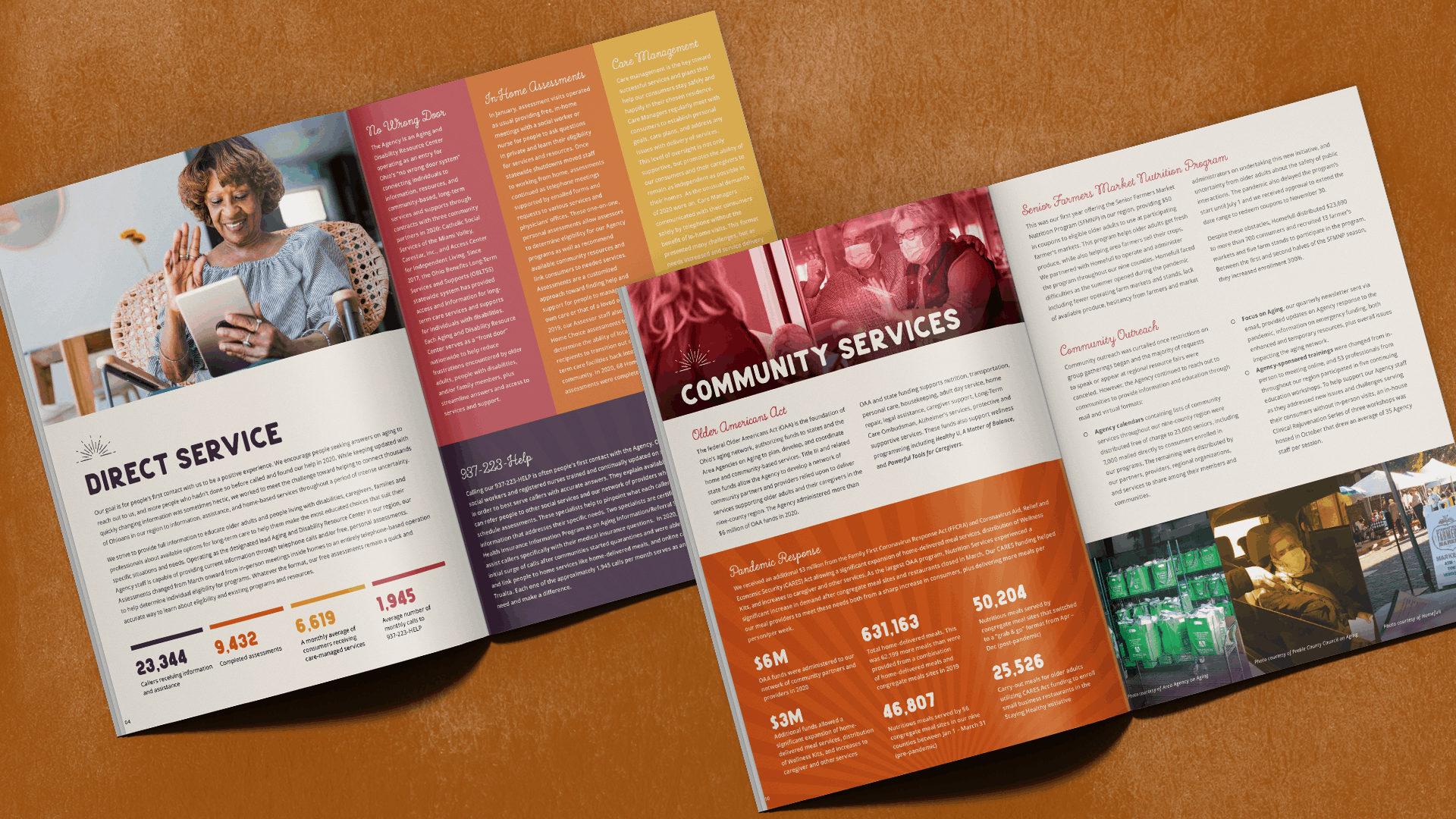
This takes on a more conceptual approach. The subtle sun rays represent the light AAA brings to their members. For some of their members, AAA is the only contact they have. The color palette is bright, but a little on the muted side. We don't want to gloss over the fact that the pandemic was a very sad and challenging time for many people. Miniature sun icons can be used throughout the report as well to highlight the "light" of services that AAA provides.
2019
Support. Our Goal. Our Strength
Recognition // Silver Addy, AAF Dayton
Area Agency on Aging, PSA 2 is an independent, private, nonprofit corporation that plans and funds services for older persons in west central Ohio. The design elements in this year’s report revolved around a light, airy, floral theme to match the television spots.
2018
25 Years of Caring 1993-2018
Recognition // Gold Addy, AAF Dayton; Silver Addy Districts
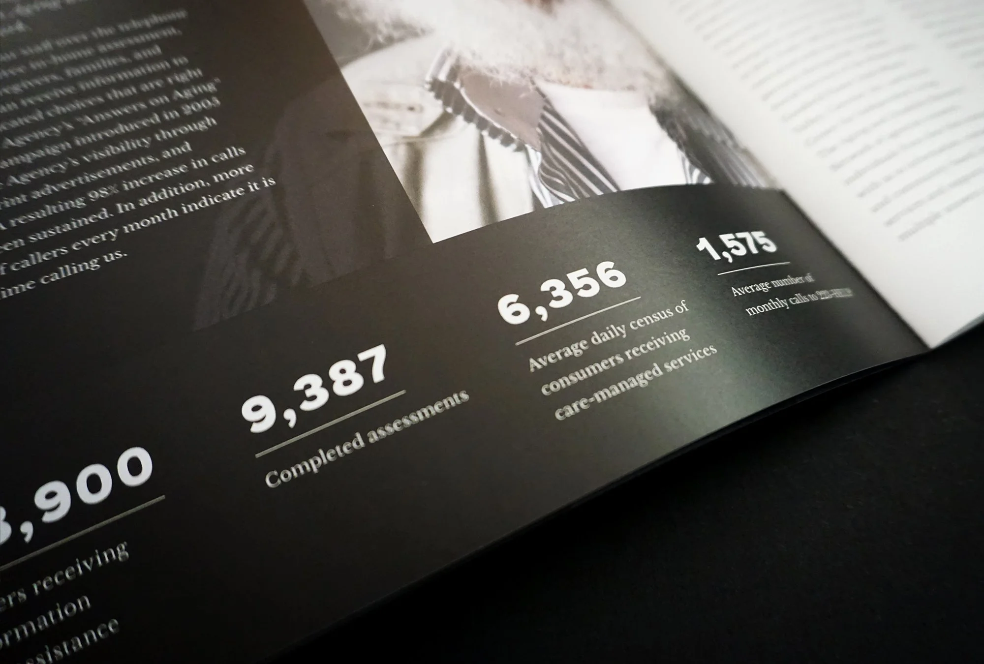
This year, AAA celebrated its 25th anniversary. To commemorate this “silver” milestone, the cover was printed on pearlescent paper with white ink to make the design shine like silver. Using this paper also created a cool effect on the inside front and back covers.
2017
Connecting You With Solutions
This year’s theme was “Connecting You with Solutions.” Aside from the heartwarming photography, there are many nuances throughout the book that tie back to the connections theme; the color palette takes on copper tones because copper is a conductive metal, a script font is used in headlines, and there is a reoccurring graphic from the cover that shows up somewhere on each spread. Overall, the client was thrilled with our design and has received many positive comments from their staff, including “being our best one yet.”
2016
Support Is Our Strength
The 2016 Annual Report theme pushed the boundaries of what has been done in the past. We updated the color palette to feature warm, inviting tones. The layout utilizes full-bleed imagery that stretches across a spread and is paired with contemporary, youthful typography. The cover symbolizes the “Support Is Our Strength” theme by featuring the brick-like design element which is seen throughout the book


